WEB DESIGN | BRANDED ASSETS | STYLEGUIDE
Brunch Club
Adding Some Boozy Personality to Brunch Club, an Indulgent New Concept
OBJECTIVE
Create a website for Brunch Club that keeps users on the site for longer by creating a destination they can interact with, get updates from, and view as an extension of the physical restaurant.
Important Site Traits: bright, informative, a sense of humor; as though your boozy best friend were sitting right next to you.
Target Market: savvy New York-based foodies, brunch as a way of life aficionados, and international travelers who crave not only good food but an experience.
SERVICES
Web Design
Branded Assets
Styleguide
Approach
Because the brand didn’t have assets, we started with the style guide, including the logo. Next, a style tile was mocked up, showing how the elements would play together. The client chose one of the two templates we put forward, allowing us to wireframe the landing page. When the landing page was approved, the rest of the site was mocked up and is now in the development stage using the Foodie Theme.
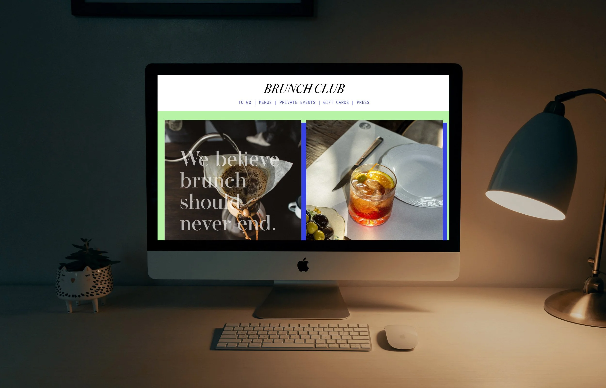
Logo: The logo is the element that grounds this indulgently over-the-top site. The uppercase, italicized font in black is grounding amongst the other colors, pulling the site together.
Color Palette: We created a fresh and bold color scheme, a bold calcimine blue, two vivid purples, and a fresh mint and pistachio greens, less lettuce and more vibie on a bright boozy brunch day when the cocktail kicks in and your senses are turned on. All the colors combine to create a high vibe and work perfectly with the fruity colors of bright oranges and reds of strawberries.
We created a bold and fresh color scheme, utilizing a bold calcimine blue and a fresh, almost fluorescent green that is less lettuce and more vibing on a bright boozy brunch day when the cocktail kicks in and your senses are turned on. All of the colors combine to create a high vibe and work perfectly with the fruity additions of bright oranges and strawberry reds.
Brand Guidelines: help establish a brand’s identity and promote consistency across touchpoints. This is important and can lead to a more recognizable and memorable brand.
Typography: AA combo of a striking serif for headers and legible sans serif for all else.
Headings: Operetta 12; everything else, Proxima Nova.
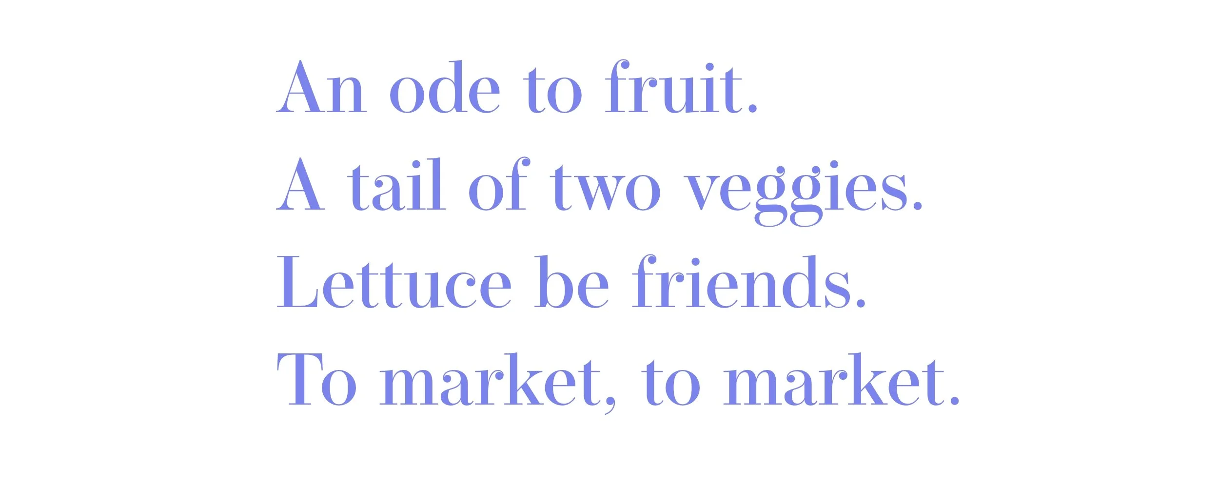
Typography: a combination of a classic and stylish serif was used. For the menus, a typewriter-esque font was chosen for its playfulness.
Tone of Voice: the tone is fun and cheeky but also uses lots of colloquial, friendly phrases because that is the essence of Brunch Club.
Overall Web Design: clean and simple, easy-to-use navigation, and strong imagery with vibrant color pairings. We wanted the site to emulate the feeling of the restaurant itself: a shared experience, creating somewhere where old friends hang, drink, and make new friends.
Additional Features: a taste-making quiz that suggests menu items and pairings based off of the user’s flavor preferences. It is a fun, interactive way of exposing the customer to parts of the menu that they may not usually consider on their own.


